 When it comes to using color selection for your business, it’s considered both an art and a science. Color impacts the emotions and actions of your target audience. Color is our worldview, it’s instinctive, human, and intrinsic to who we are and feel.
We have an emotional, unconscious response to different colors. This is what matters in marketing, the emotional response, and using color is a huge piece of that. There are scientific ways of thinking about color that helps us elicit a certain response.
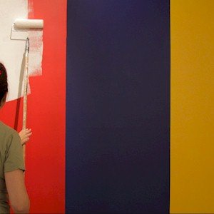
For instance, if you consider the color wheel, there are warm colors and cool colors. What each of these tones will provoke is a different response. Warm gets an active response, while cool gets us a calming response. When it comes to marketing, you need to ask yourself, what’s going to work with your message.
Warm colors in nature, such as the reds and yellows, think sun and fire, which indicates action. When you see or feel fire in nature, it can either draw you in, or be a sign to get out of danger. Either way, the unconscious message is to “Act Now!”
On the other hand, cool colors don’t elicit action. They invoke serene, calm, stability, such as the earth and sky. The message is “steady as she goes,” or “we’re stable.” If you’re trying to calm the viewer or impart a sense of timelessness, blues and cooler colors are excellent.
There are also the variations, the combinations of the three primary colors that are extremely complex, this when it comes to our unconscious responses. For instance, how pink is used in prisons to stimulate a more human response.
How Color Impacts Brand Identity
In marketing, you’re looking to connect with your audience. So it’s important to include some form of warm tones to help people feel comforted, and bring in a sense of humanity.
Even if you’re going after an industrial or serene feel, you need to temper cool neutrals with something warmer. Blacks, grays, and blues tend to be authoritative and sterile. By just adding an element of warmth, you can completely change the response a logo or branding triggers.
You see red in a lot in logos because it means “take action.” When you work outside of the primary colors, anything other than red, yellow, or blue, you create an edgier, more complex feel.
Orange is warm but edgy, because it’s not a prime color. Purple is extremely complex, it’s warm and cool, and can shift depending on the light and the other colors surrounding it.
Using Color In Marketing Materials
Color matters everywhere and most importantly for your identity. It’s your first chance to say if you’re contemporary and hip, cool and industrial, warm and humanistic, intellectual and solid, or stable and traditional.
If you’re a large financial corporation or the government, you could portray intelligence and stability by using blues and grays. If you’re wanting to project or demand action, address an urgent issue, you could add shades of yellow.
Color is an inexpensive way to make a statement. A bright red postcard with large-font type on it, is more likely to be recognized than something that’s gray or blue.
Using a hot color and a lot of it, may be all the design you need. Now this may not work for a hip urban spa, so you have to keep in mind what you’re selling or feeling.
If you’re selling “tranquil,” then bright yellow isn’t the answer. But something with a warm color, like beige, mixed in with the serenity imparted by gray or green would work.
How To Decide On The Proper Color
Don’t think that blue is the only color on the planet for business. It’s a safe color, it’s everywhere around us and in large doses, the sky, the ocean, the institutions. So there’s a comfort level with it as most are afraid to take a risk. But think of those companies who took a big risk with color, such as using brown.
The smaller the business, the more compelling the reason to take color risks. You don’t have a whole team out there marketing for you, so your website, logo, and business card has to do a lot of the leg work for you.
Using Color Effectively
A yoga company decided to use pink and black as a background for their studio. They decided on a warmer variation which led them to this color combination palette. A combination which is rarely used, but pink and black is warm, human, and comforting.
Another example can be a company entering a trade-show. Try going with wild hot colors for a conservative audience. What you’ll do is stand out in a cold boring austere convention center. You’re pretty much in their face, and it can work out great as consumers will flock to your booth.
You can adjust colors going from purely cool and industrial to adding warmer tones. So without changing the design layout or logo at all, it can make all the difference.
The Value Of Color In Marketing
There are a variety of industry standards for business when it comes to color application. There are resources which will forecast the most popular color trends, along with predictions on the upcoming season or the upcoming years.
What you need to do is trust your instincts. There is a science to color, but it’s not a complicated process. It’s also okay to choose a color because you like it, and it makes you happy.
What color does is it elicits and activates certain hidden human emotions. So make sure that you always pay attention to yours, this when it comes to choosing a color theme for your business.